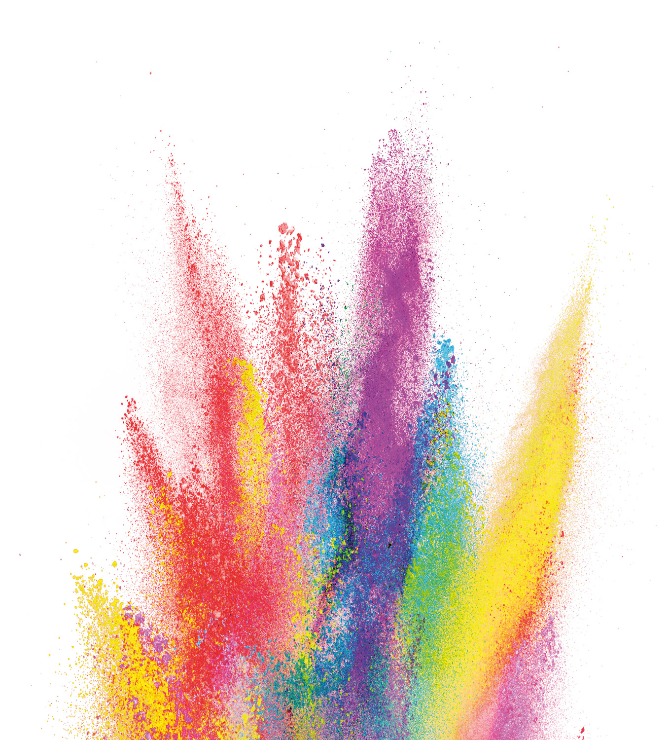
What influence colours have on the mental state?
 Colours affect your mood. A green painted wall in your house makes you calm, but you also get faster a cold sensation. The colour red, gives a warm feeling and makes you more energetic. The colour of your living room, your clothes and even the flowers in your garden, can determine the way you feel. Bring extra colour to your home, in the dark months of December and you feel more dynamic and healthier. Colour makes you feel happy, cheerful and fitter or cold, somber and with no energy.
So with material and colour you can create a certain atmosphere. There are no bad colours, but there can be bad combinations. A good balance between dark and light colours and warm and cool colours, ensure balance and serenity in a room.
With the right colour combination, soft furniture in a room will not become an independent stimulus, but it will form an attractive whole with the rest of the room. Light colours reflect the light, where dark colours absorb the light. In a multisensory room, we work a lot with light effects.
If a multisensoy room is realised in a light shade, such as white or cream, this sometimes looks a bit monotonous and cold, when the sensory products are not switched on. However, if the present sensory products are activated on, you have the biggest effect in this same white room. Light reflects on these lighter coloured surfaces, giving the room a warmer and more atmospheric appearance.
For people with a vision problem, a space in one colour can sometimes be confusing, because there is too little contrast between the different surfaces. For this reason, we at Nenko, often choose two colours for
a multisensory room, to clearly differentiate between horizontal and vertical surfaces.
Curious about which colours you can choose for our customized products? View the Colour charts here.
Do you need more information regarding the colour choise for your room or product?
Please contact one of our advisors!